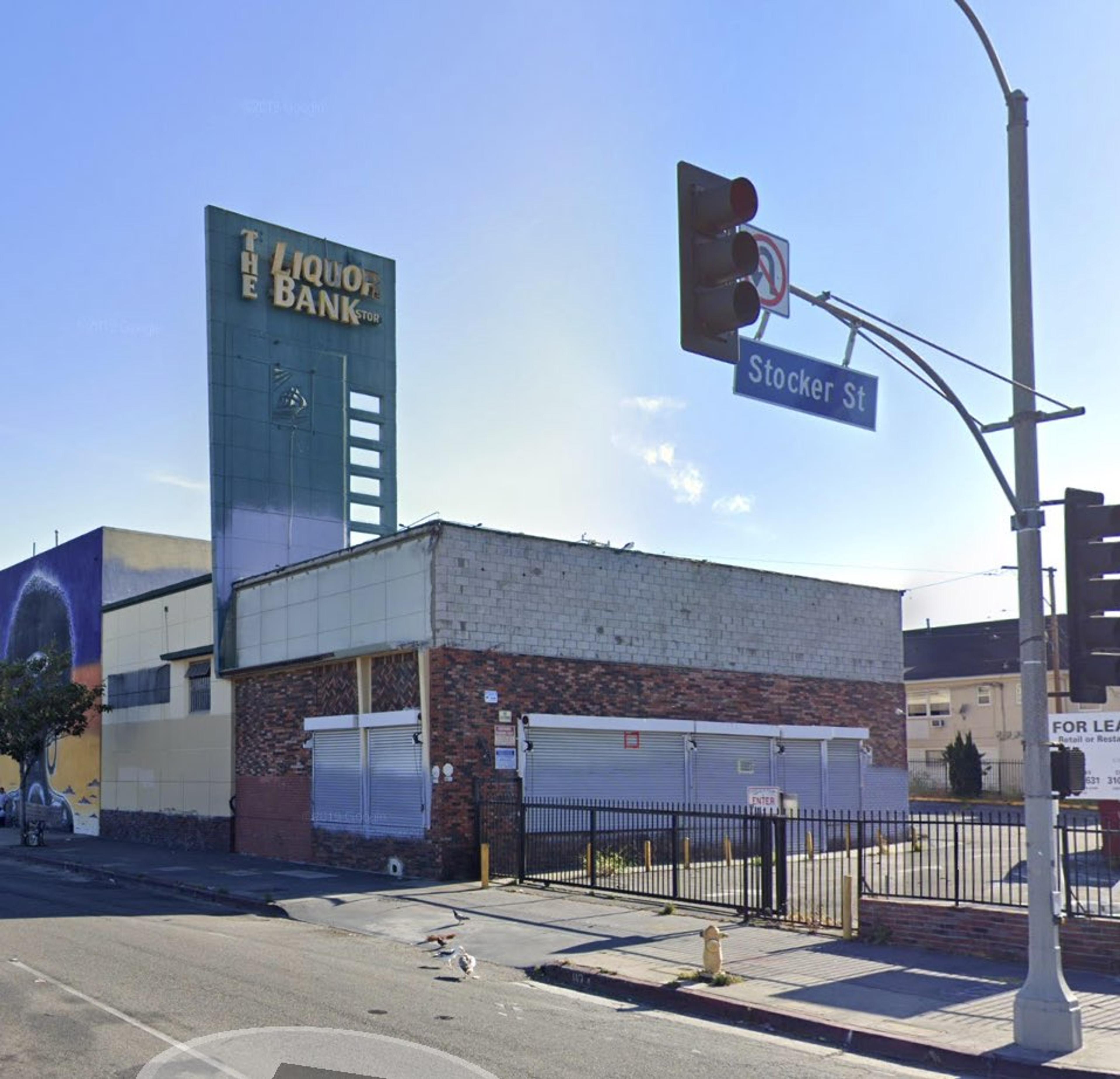
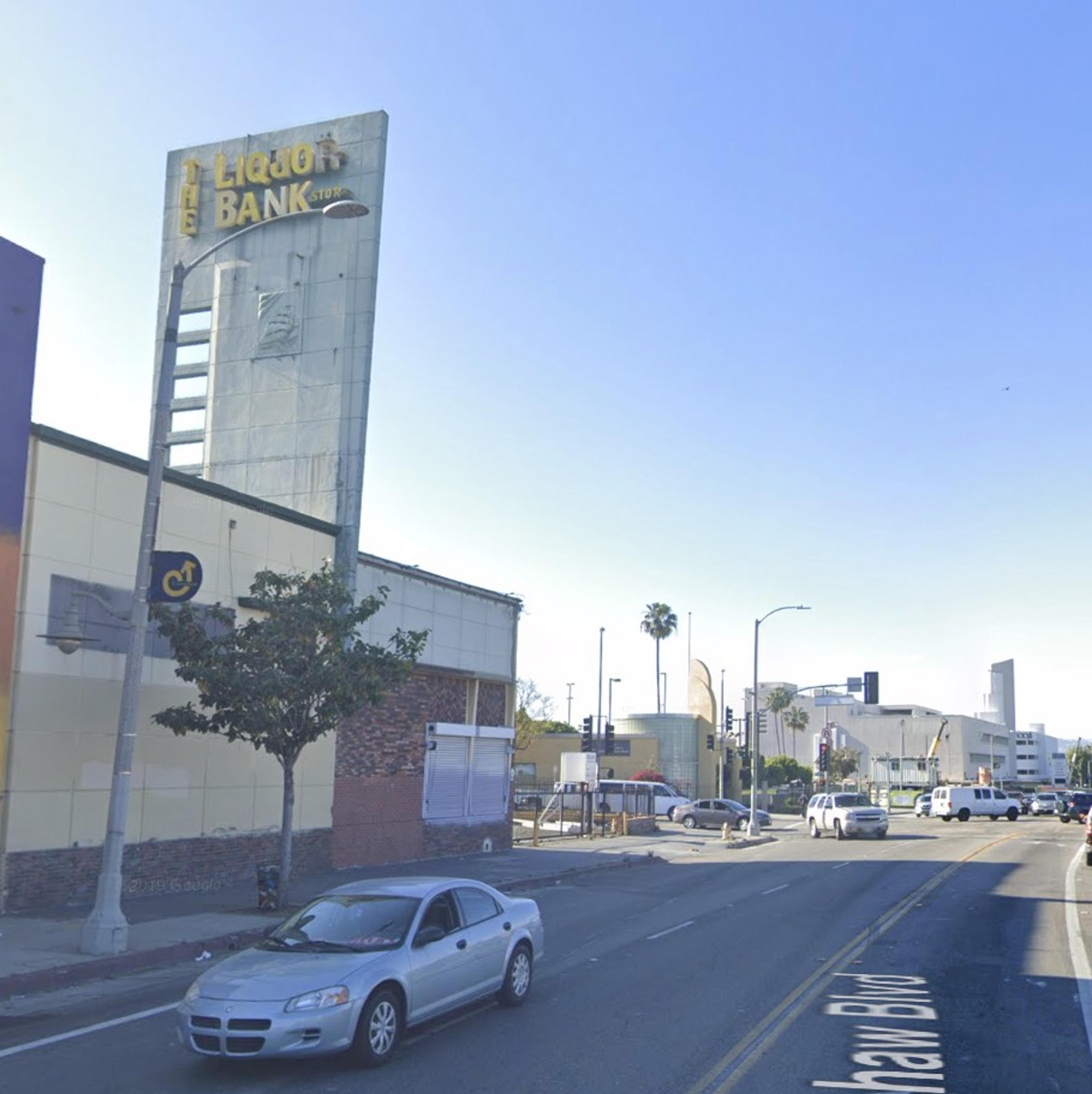
Down on Crenshaw there’s The Liquor Bank, which is my kind of place to make a withdrawal. And appropriately named because it is, in fact, an old bank. Look closely, see the ship on the sign pylon?—that’s the USS Portsmouth, erstwhile symbol of Bank of America. (San Francisco B of A founder Amadeo Giannini was enamored of the Portsmouth, as it had secured his city-by-the-bay for America during the Mexican War.)
This Bank of America was built in 1949 and designed by Raymond Raleigh Shaw AIA, with William D. Coffey, Consulting Structural Engineer. Raymond Shaw is best known for his 1920s designs, like the Pacific Southwest Building and San Joaquin Light & Power, both in Fresno.
Shaw did some number of Bank of America branches; he altered the exterior of the B of A in Beverly Hills on Wilshire in 1948 (although that was subsequently redesigned _again_ in 1963 in New Formalist/Brutalist style by Sidney Eisenshtat—which after being deemed eligible for listing on the National Register, was dutifuly torn down by Metro as part of the subway extension). Here is a 1951 example of a Shaw B of A at 8501 Pico—
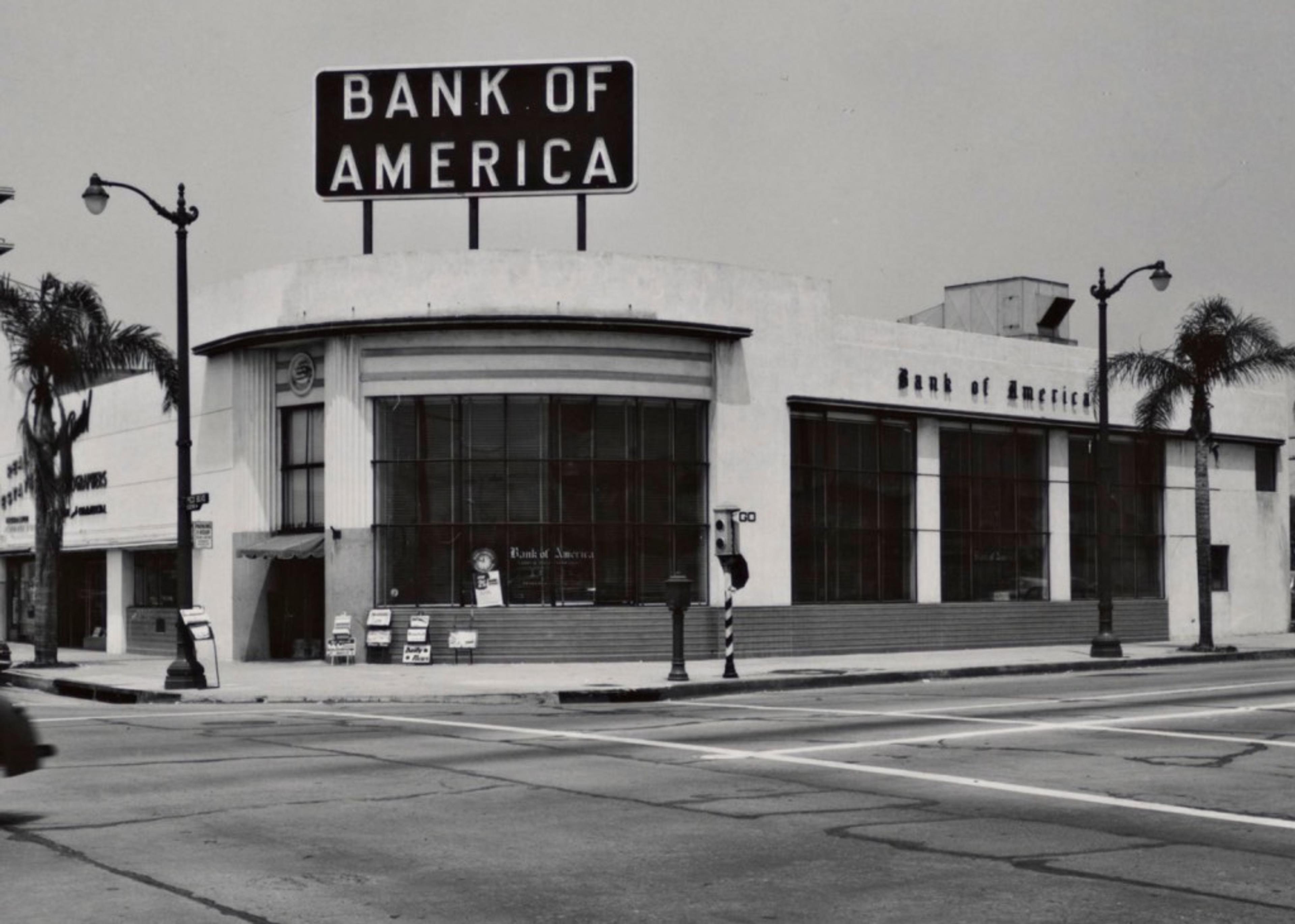
Still standing, and still a Bank of America, but do yourself a favor and don’t go on Google Streetview to see what’s become of her. Getty
Shaw designed banks across the southland through the 1950s, but received his largest commission when he was hired, again using Coffey as engineer, to produce the Corporate Modern Banco Hipotecario in San Salvador in 1958. He retired soon after and died in 1967.
In any event, back to our pal at Crenshaw and Stocker: it’s 1949, and 1949 was smack in the thick of the Great Age of the Late Moderne. Late Moderne was born to Southern California and defines Southern California as well as—no, better than—any other architectural style. What is this Late Moderne, you ask? The sleekness of Streamline, and the ribbon-window rectangularity of International style, melded in the late 30s, and flowered in the mid-40s, to produce a new vernacular. You know it when you see it: warm materials form large simple volumes locked in asymmetrical sculptural compositions, with irregular angles and curves, punctuated by certain ornamental motifs—egg crate sun shades, grills, bezeled windows, tapered and punctured fins, canopies, and of course large sign pylons with bold neon. Well, _that’s_ a lot of words; it’s those buildings what look like this.
The style was short-lived, though, as Modernism went another way and the likes of Lautner and Eames and Armét & Davis began to explore the structural expressionism of trusses and cantilevers. Thus every Late Moderne is a treasure, and some are preserved, like Wayne McAllister’s Bob’s Big Boy, while some just hang on, like Stiles Clements’s Windsor Hills Shopping Center, yet some are criminally demolished, like Clements’s Mullen & Bluett.
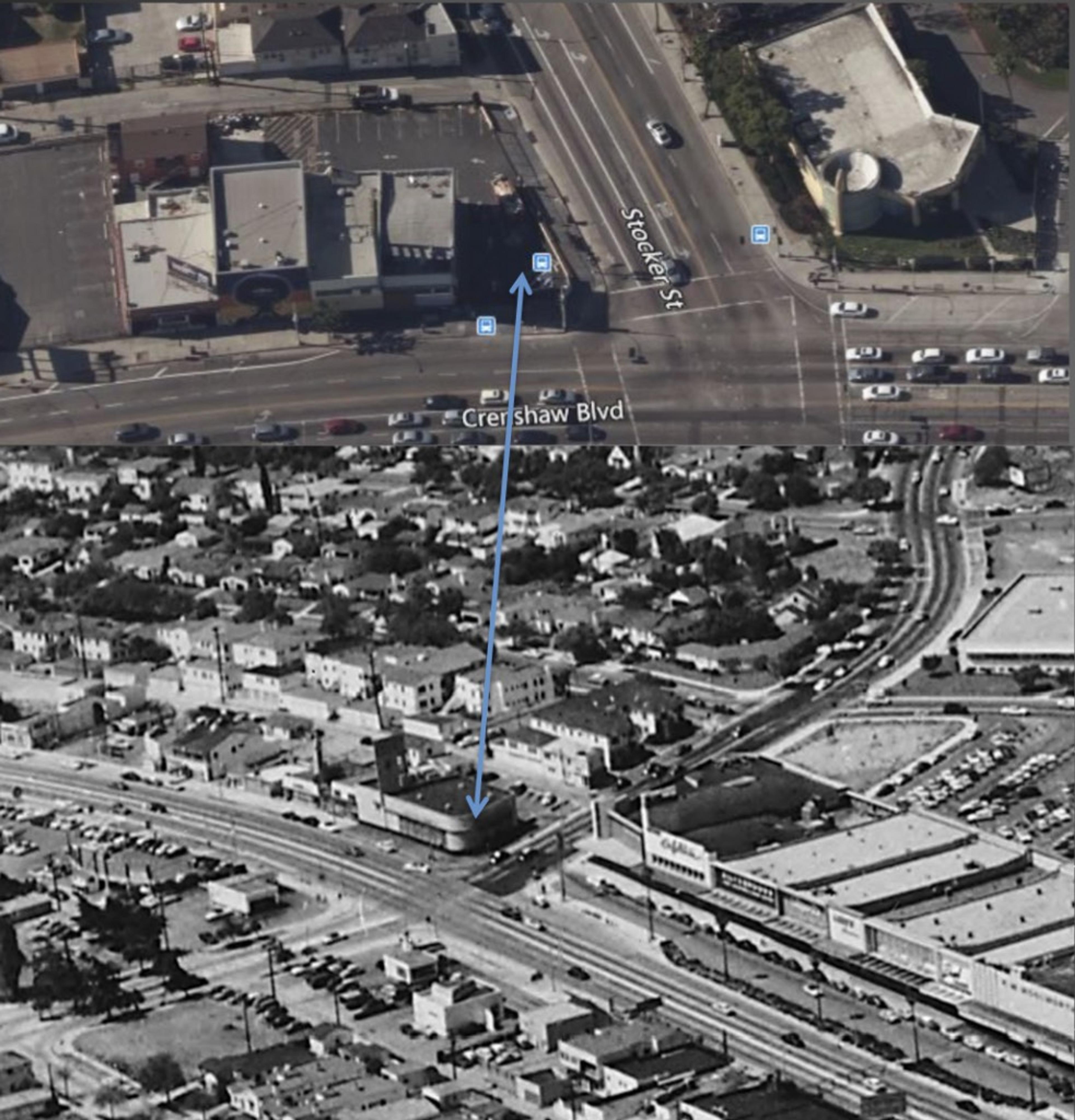
In any event, Shaw’s bank is not long for this world. Or at least what’s left of it; in all honesty, half of it has already been removed. As you can see, the structure once ran all the way to the corner, but had a chunk of its front removed in September 1976 when it became a liquor store, and Liquor Bank hired Van Nuys architect Andrew F. Gutt to design a new facade.
via USC Digital Archives

What I find additionally sad about losing this cool pylon-sign is that it’s just down the street from one of the great pylon-signs in all Los Angeles, the 1947 Albert B. Gardner/Edward W. Carter-designed Broadway Department Store, which has the greatest Moderne façade that ever was. Read more about the Crenshaw Broadway here and here. Fortunately, the Broadway and A. C. Martin’s May Company are being worked into the mall’s current redevelopment (ten-story office tower; eight-story, 400-room hotel; thousand condos and apartments; the whole bit). If Capri Capital can work those historic buildings into their mall redevelopment, maybe developer Axiom will incorporate the Liquor Bank!
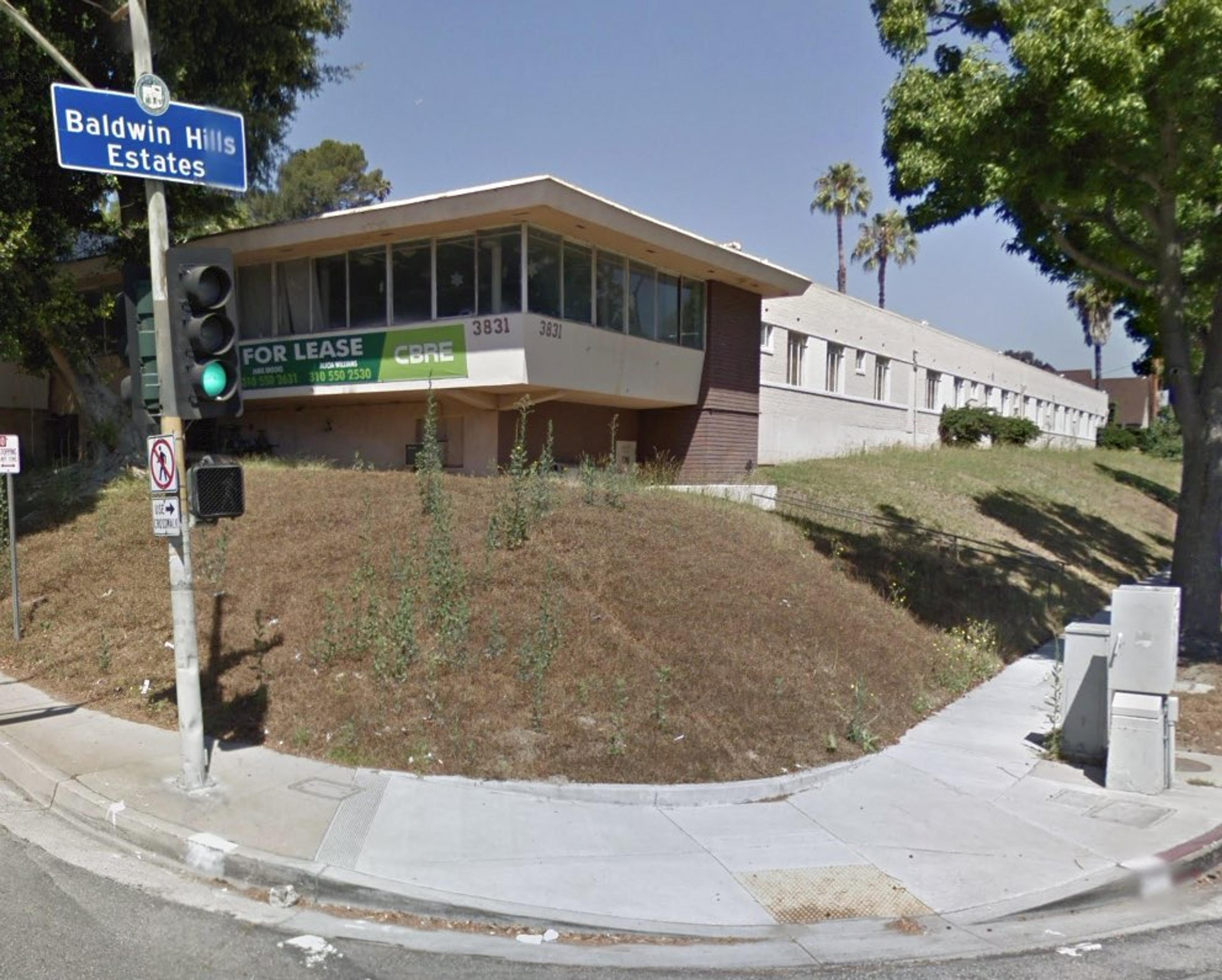
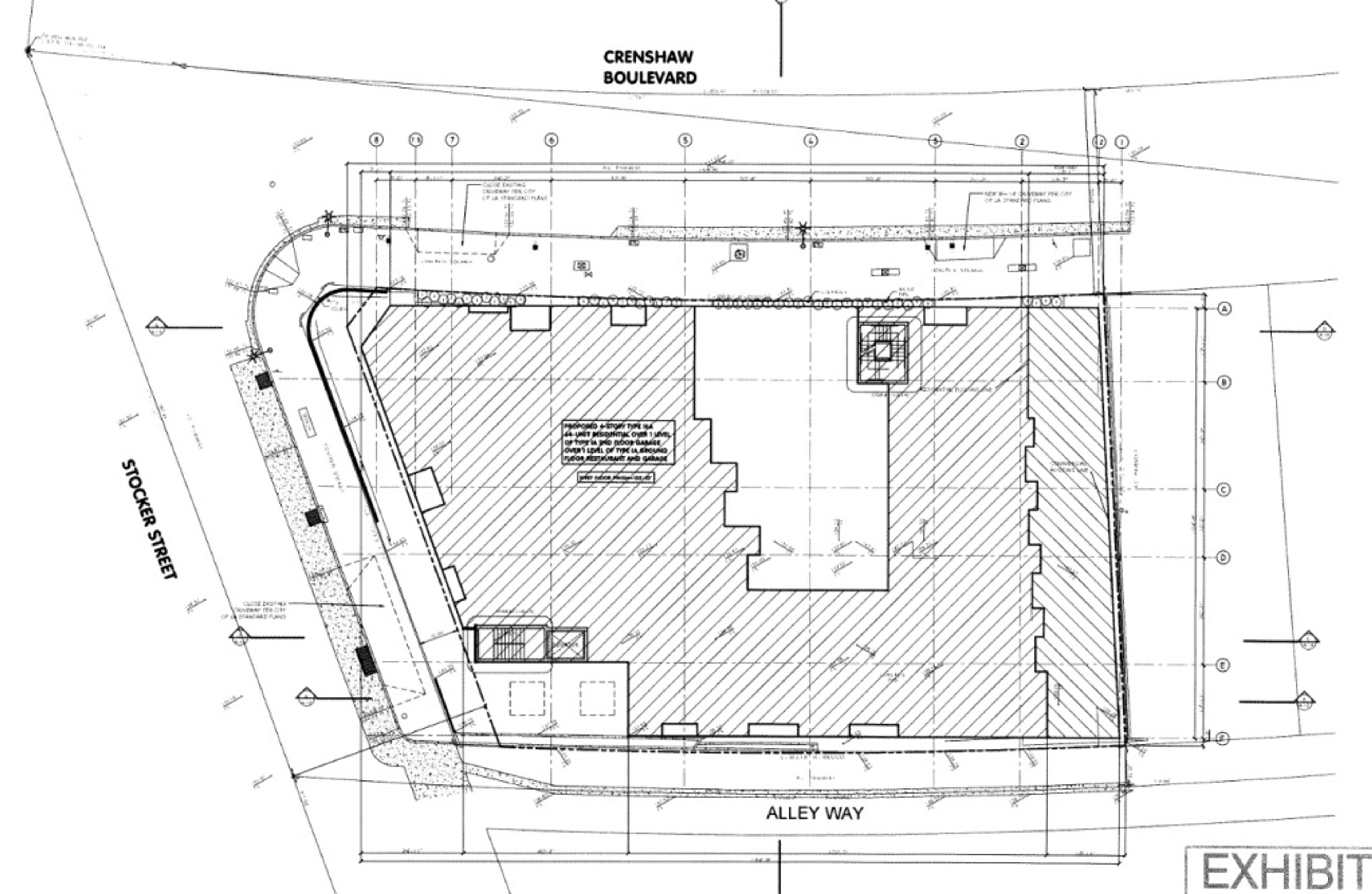
Uh, probably not. Let’s take a look at another one of Axiom’s projects, just up the road at 3831 Stocker. This was a hospital built by Lester M. Morrison in 1953, using architects Riener C. Nielsen and Gene E. Moffatt. Axiom has razed everything and it’s to be 127 market rate units (or so says their website; according to this, though, they’re only allowed 74 units even with the density bonus).
The firm of Nielsen & Moffatt designed all over the southland and opened an Oakland office in 1959. They specialized in hospitals, medical-clinical buildings, homes for the aged, and similar institutions
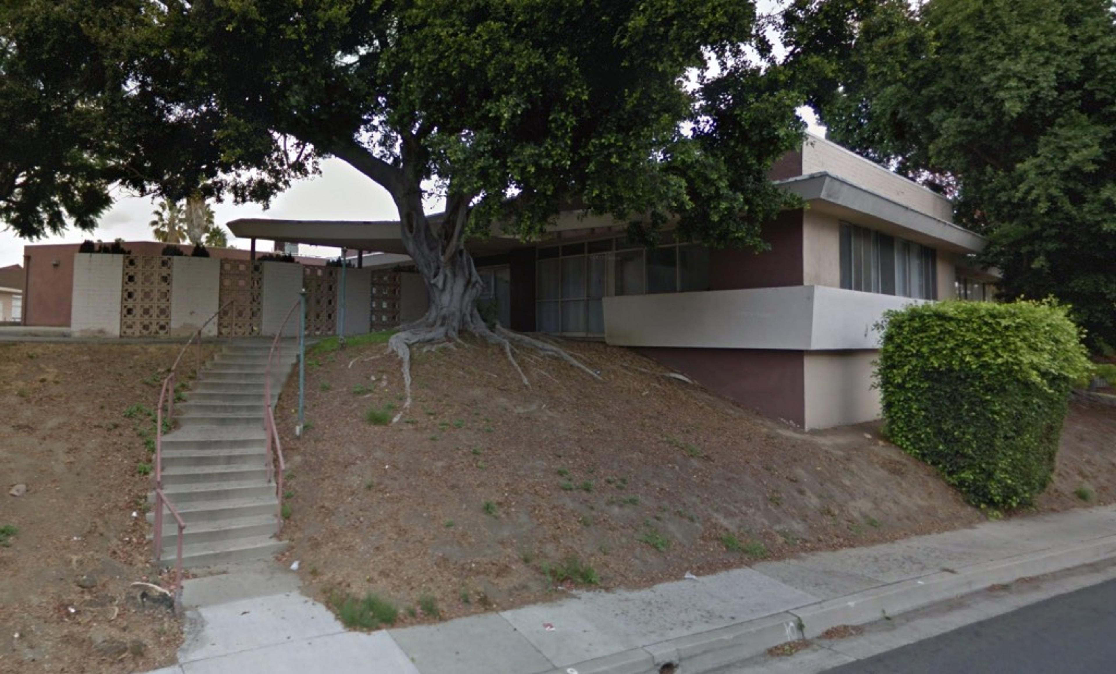
Ooo, check out the concrete sunscreen
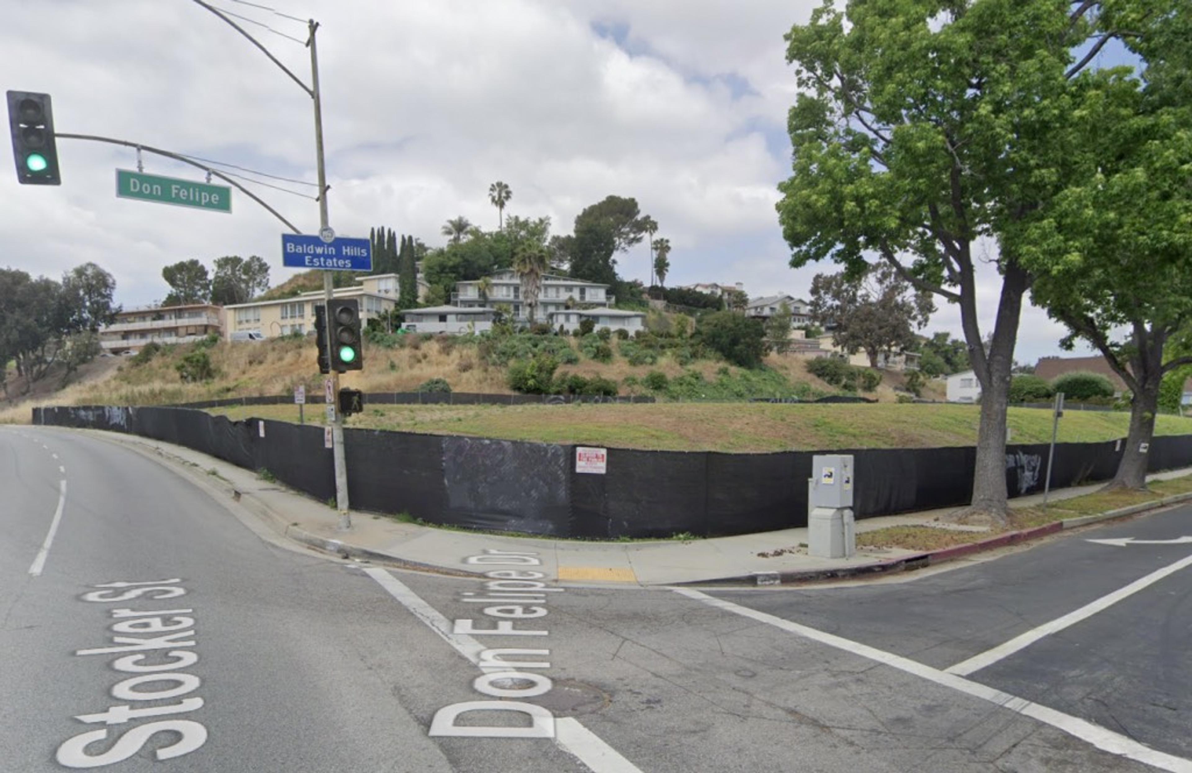
Gosh, didn’t even leave a tree
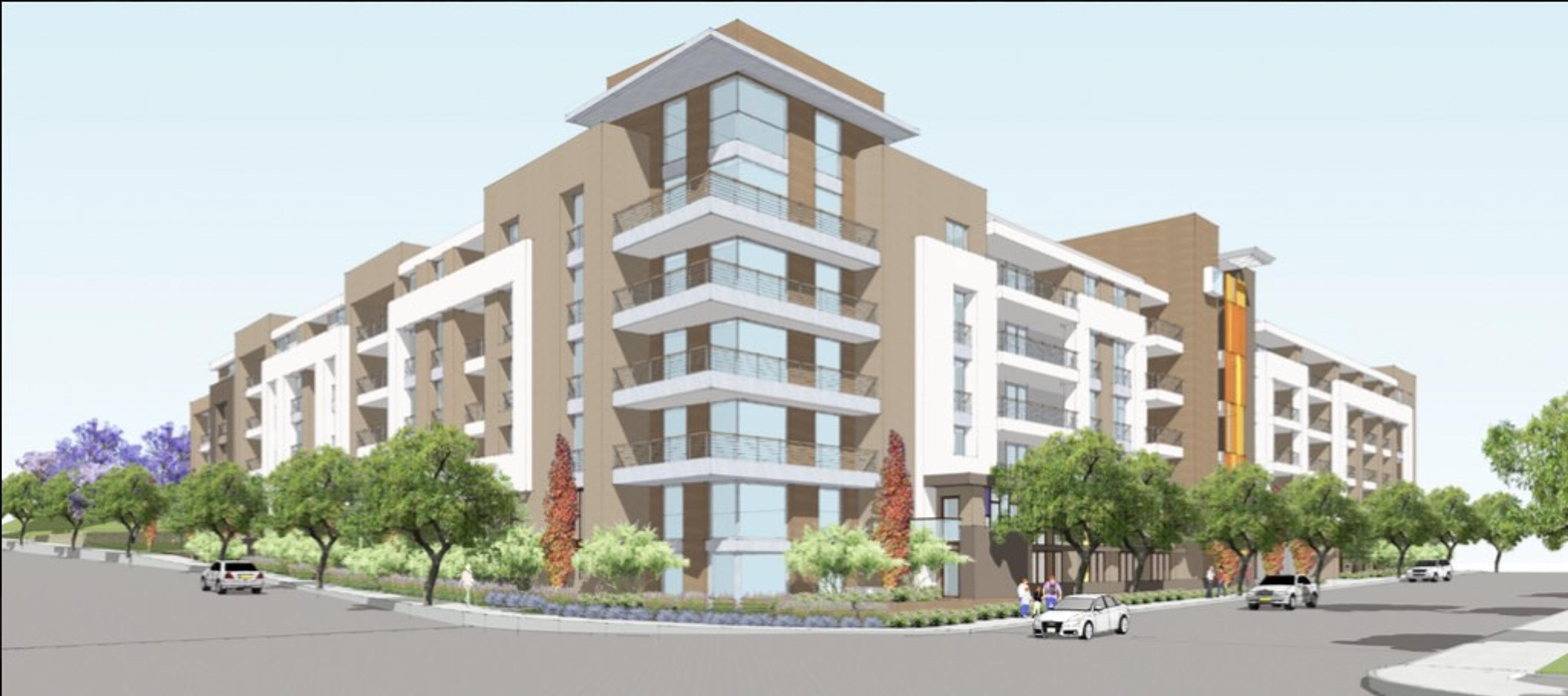
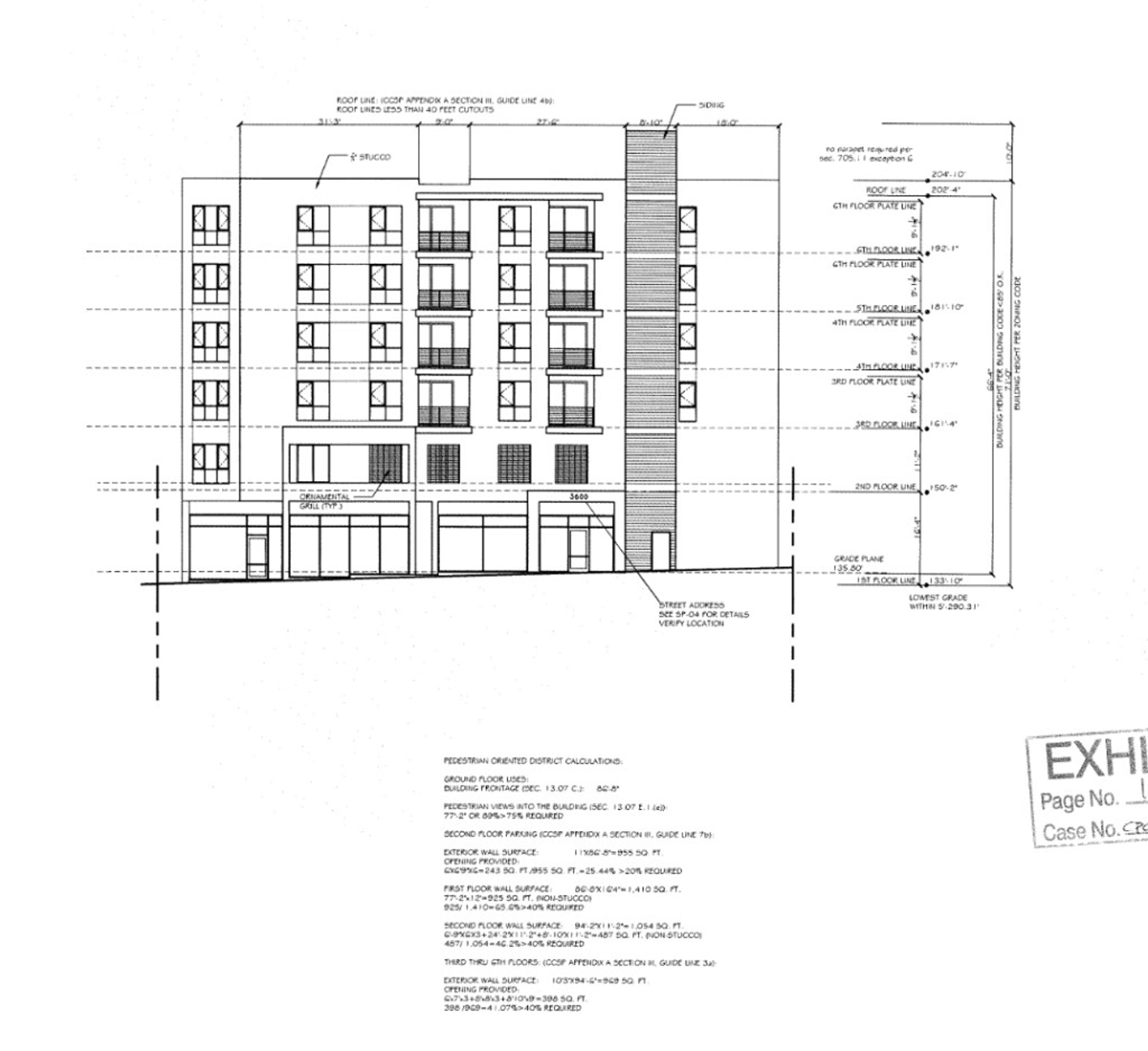
I suppose we can expect something vaguely like this for the Liquor Bank site
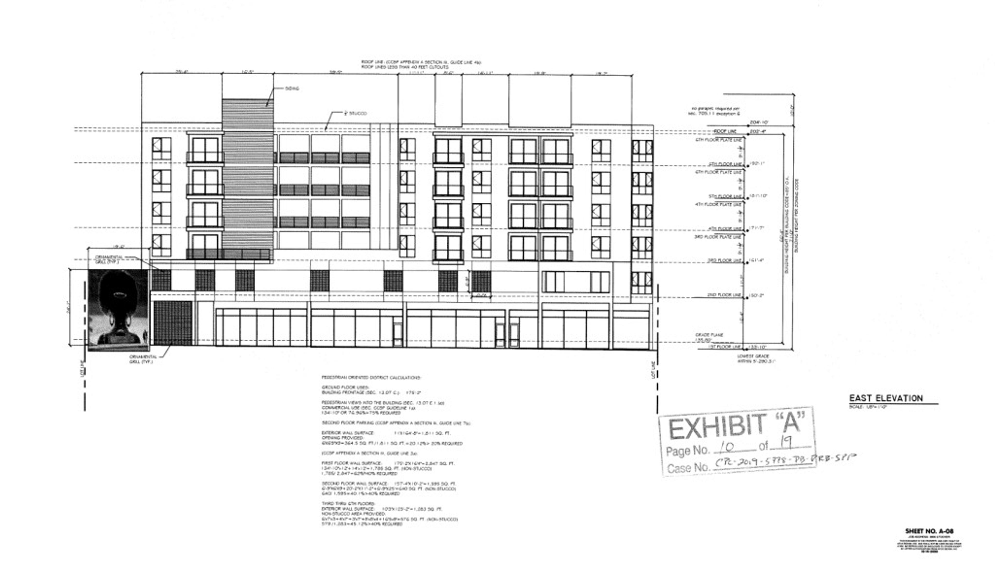
Aaaaand here’s what it will look like, oh, glory be
I saw a grey featureless box just like this once in Greyfeaturelessboxton, Indiana
Postscript—if you dig Late Moderne and want to learn more, no, there isn’t a book about it, and yes, there should be. Best I can do is point you to here where you may read about Late Moderne in general (pp. 36-37) and the great Rowland Crawford in particular (pp. 43-46; see accompanying images on pp. 70-81.) More importantly, there is a book that discusses Late Moderne, and better yet, in relationship to its rarely-studied expression in residential construction. I can’t recommend it enough, and you should buy it now.
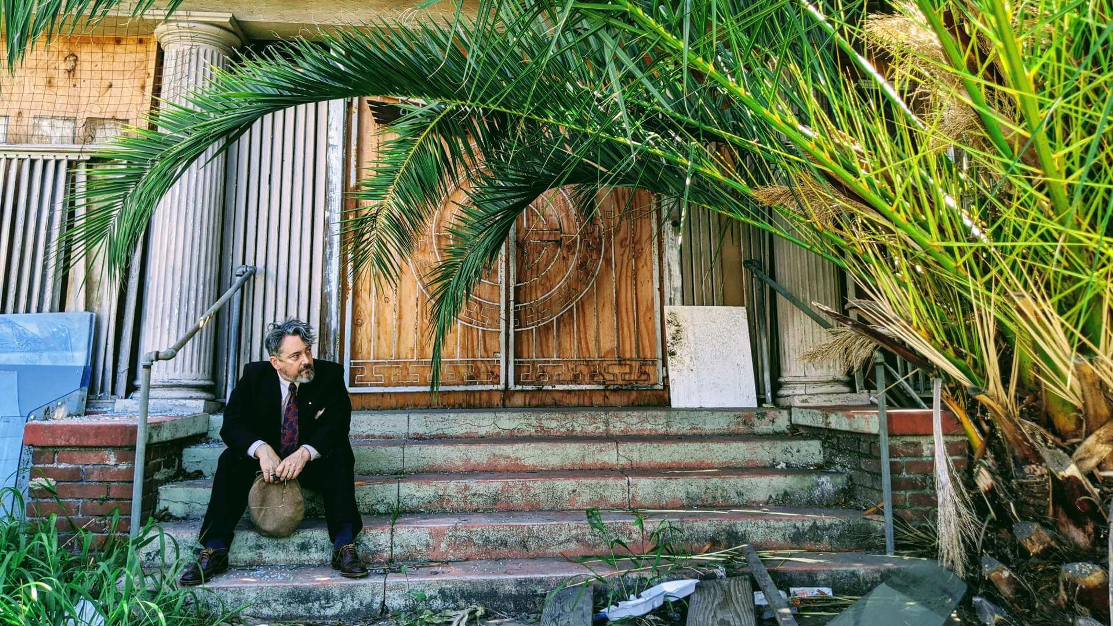
About Nathan Marsak
NATHAN MARSAK says: “I came to praise Los Angeles, not to bury her. And yet developers, City Hall and social reformers work in concert to effect wholesale demolition, removing the human scale of my town, tossing its charm into a landfill. The least I can do is memorialize in real time those places worth noting, as they slide inexorably into memory. In college I studied under Banham. I learned to love Los Angeles via Reyner’s teachings (and came to abjure Mike Davis and his lurid, fanciful, laughably-researched assertions). In grad school I focused on visionary urbanism and technological utopianism—so while some may find the premise of preserving communities so much ill-considered reactionary twaddle, at least I have a background in the other side. Anyway, I moved to Los Angeles, and began to document. I drove about shooting neon signs. I put endless miles across the Plains of Id on the old Packard as part of the 1947project; when Kim Cooper blogged about some bad lunch meat in Compton, I drove down to there to check on the scene of the crime (never via freeway—you can’t really learn Los Angeles unless you study her from the surface streets). But in short order one landmark after another disappeared. Few demolitions are as contentious or high profile as the Ambassador or Parker Center; rather, it is all the little houses and commercial buildings the social engineers are desperate to destroy in the name of the Greater Good. The fabric of our city is woven together by communities and neighborhoods who no longer have a say in their zoning or planning so it’s important to shine a light on these vanishing treasures, now, before the remarkable character of our city is wiped away like a stain from a countertop. (But Nathan, you say, it’s just this one house—no, it isn’t. Principiis obsta, finem respice.) And who knows, one might even be saved. Excelsior!””
Nathan’s blogs are: Bunker Hill Los Angeles, RIP Los Angeles & On Bunker Hill.
